I was approached by Luvmycase Limited to develop a logo and an ecommerce site selling phone cases, plus functionality for a user to upload and edit their own photos for a case.
The brand, colour scheme and site are deliberately simple and vibrant in order to stand out from the competition in what is a hugely saturated market.
This project is in it’s infancy – with the custom upload facility and a social marketing strategy still under development, there will be much more to come for Luvmycase.
Update: Unfortunately, due to change of circumstances for the owner of Luvmycase, this project is no longer running and the site has closed down.
Logo design.
Luvmycase had an existing logo when we first met, but it lacked originality and strength. In a difficult market the brand would need to be bold and distinguished. The new Luvmycase logo was created.

Colour scheme.
The brand is reinforced with a strong colour scheme, integrated into the site to provide contrast and allow important elements and CTA’s to stand out.

Typography.
The brand uses the font DIN Bold which has a solid, rigid structure and curves that mirror that of the simplified case icon in the logo. Two complementary typefaces were chosen for the headings and body copy of the website and all marketing material.

Website design and development.
Luvmycase are a small, independent company, who were just starting out when I began developing the website. The site was to sell a selection of pre-designed cases and offer the ability for users to upload their own photo’s to be printed onto cases.
Content preparation.
There were no existing images of the finished cases, so extensive work was carried out in Photoshop, mapping over 200 designs to photographs of the different cases.

eCommerce online shop.
This was a startup venture with a strict budget. To keep costs down an existing WordPress theme was carefully selected from which I created a custom child theme, branded and tailored to the requirements of Luvmycase. WooCommerce, a WordPress eCommerce toolkit, was chosen for the shopping functionality and customisations were made as required. The result; a beautifully crafted design with a strong brand presence, ready to pitch it’s business within a difficult marketplace.


Social media put to good use.
Being a new contender in the market, Luvmycase needed to raise awareness of its existence. Discount codes were offered to those who shared the page via Facebook, LinkedIn, Twitter or Google+.
A Facebook promotion had been planned that would encourage users to share a link in order to access a giveaway. 5 friends were required to share the link before access was granted.


The right case for the right device.
Throughout the website, case designs are masked using the simplified case icon from the logo. This increase brand recognition whilst emphasising the design over the case. When choosing the actual device, the image updates live on screen to give users a better feel for how the design will look on their device.


Responsive checkout.
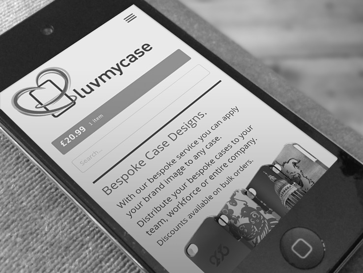
An important consideration to the Luvmycase website was for it to work well on all devices, especially mobile phones. After all, users are buying a case for their phone, there’s a high possibility they’ll be using that phone when shopping.
The entire site is responsive and scales accordingly for different screen sizes. The layout shifts to provide ease of use and clarity of information at any size. We paid particular attention to the shopping cart to ensure users would be able to complete their purchase easily.


